
Skincare
Current Obsessions: Bright and Bold
Jul
For years, the safest room in America seemed to come with white walls, a beige sofa, a pale rug, and one lonely houseplant trying to provide the personality. It was tasteful. It was peaceful. It was also occasionally indistinguishable from the waiting room at a very expensive dentist.
Now, color is marching back through the front door. Cherry red, cobalt blue, citrus yellow, electric pink, saturated green, and deep purple are appearing on cabinets, ceilings, furniture, art, and accessories. Patterns are getting larger. Lighting is becoming sculptural. Even practical objects such as kettles, trays, and storage boxes are being treated as opportunities for visual mischief.
The bright and bold design movement is not simply about making everything louder. At its best, it is about creating interiors that feel personal, energetic, and emotionally alive. The goal is not to transform a living room into a bag of jelly beans. The goal is to use color, shape, and pattern with enough confidence that a home stops looking staged and starts looking loved.
Why Bright and Bold Design Feels Right Now
Colorful interiors have always moved in cycles. Midcentury homes embraced turquoise, coral, mint, pink, and cheerful yellow. The 1970s favored avocado, orange, brown, and earthy pattern. The 1980s turned up the saturation, while the 1990s mixed primary colors with playful postmodern shapes.
More recently, cool gray and restrained minimalism dominated decorating. Those styles offered calm and simplicity, but years of nearly identical neutral rooms created a desire for something more individual. Today’s colorful interiors answer that desire without requiring homeowners to abandon good design principles.
Recent decorating trends have revived primary colors, maximalist layering, joyful shapes, floral upholstery, painted ceilings, and richly colored woodwork. Designers are also combining bold shades with natural materials, vintage furniture, and handcrafted objects. That combination keeps colorful rooms from feeling disposable or overly trendy.
Color Creates an Emotional Response
Color affects how a room is experienced. Warm shades such as red, coral, orange, and golden yellow can make social spaces feel lively and welcoming. Blues and greens often bring a restorative quality, while saturated jewel tones can make bedrooms, libraries, and dining rooms feel intimate and enveloping.
These reactions are not identical for everyone. A lemon-yellow kitchen may feel energizing to one person and like breakfast inside a highlighter to another. Personal associations, light exposure, surrounding materials, and cultural context all influence how a color feels. That is why successful bold decorating begins with preference rather than prediction.
The Colors Currently Commanding Attention
Cobalt and Electric Blue
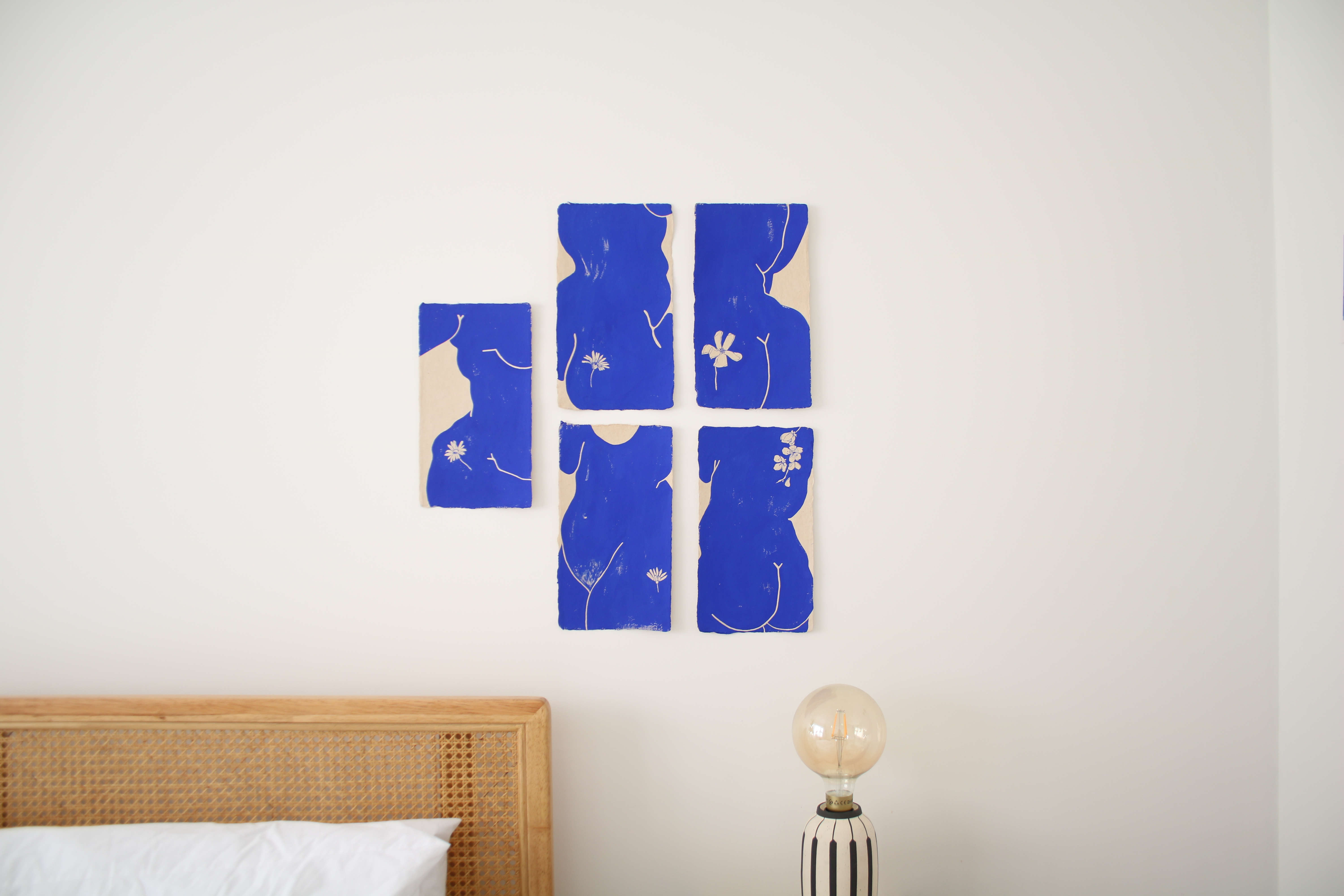
Cobalt blue has the rare ability to feel historic, modern, artistic, and slightly rebellious at the same time. It works particularly well on cabinetry, bookcases, doors, tiled surfaces, and statement furniture. Against white, cobalt appears crisp and graphic. Paired with burgundy, ochre, emerald, or warm wood, it becomes richer and more sophisticated.
For a low-risk experiment, introduce cobalt through a lamp, framed print, tray, or pair of dining chairs. A little of this color can wake up an entire neutral room faster than a double espresso.
Cherry and Tomato Red
Red is becoming an important accent because it provides immediate visual energy. A small amount can sharpen a room that otherwise feels sleepy. Think lacquered side tables, red dining chairs, painted window frames, striped cushions, or a bright cabinet tucked into an understated kitchen.
Tomato red feels warmer and more playful, while cherry red appears cleaner and more graphic. Deeper variations such as oxblood and burgundy offer drama without the visual volume of a fire-engine shade. Red also pairs beautifully with pale pink, powder blue, camel, navy, and natural oak.
Optimistic Yellow
Yellow can bring warmth to rooms that lack natural sunlight. Butter yellow creates a gentle glow, mustard adds vintage depth, and bright citrus yellow delivers a contemporary punch. It is especially effective in kitchens, breakfast areas, hallways, and workspaces.
Yellow benefits from contrast. Black hardware makes it feel graphic, while blue creates a classic complementary relationship. Terracotta and brown make it earthy. Pink turns the combination playful. The trick is to choose a yellow with an undertone that works with the room’s lighting and permanent finishes.
Pink Beyond the Nursery
Pink has expanded far beyond children’s rooms. Dusty rose can act almost like a neutral, while raspberry and hot pink deliver unapologetic personality. Plaster pink walls complement wood, brass, stone, and woven fibers. More saturated pinks work well in modern art, upholstery, lamps, and small painted furniture.
For a polished palette, combine pink with dark green, chocolate brown, oxblood, or navy. These deeper shades prevent the result from becoming overly sweet. Unless sweetness is the objective, in which case bring on the scalloped lampshade and pass the cake.
Greens with Greater Depth
Green remains popular, but the emphasis is shifting from safe, pale sage toward shades with more presence. Olive, forest green, emerald, chartreuse, and moss bring depth while maintaining a connection to nature.
Green is highly versatile because it supports both warm and cool palettes. Emerald pairs dramatically with pink or blue. Olive complements rust, cream, tobacco brown, and aged brass. Chartreuse can electrify a restrained room when used on a single chair, lamp, or artwork.
How to Use Bold Color Without Creating Visual Chaos
Begin with a Dominant Color
A strong room usually has a visual hierarchy. Select one dominant color, one supporting shade, and a smaller accent. This prevents every element from competing for attention.
For example, a room might use deep blue on the walls, rust-colored upholstery as the secondary tone, and small flashes of yellow in art and accessories. The colors are bold, but their roles are clear. Not every object needs to audition for the lead.
Repeat Colors Across the Room
Repetition makes unexpected colors feel intentional. If a room contains one bright-red lamp and nothing else remotely related to it, the lamp may look as though it arrived at the wrong address. Repeat the red in a painting, book spine, textile, or decorative object, and the room begins to feel composed.
The repetitions do not need to match perfectly. Slight variations often create more depth than exact duplication. A palette involving burgundy, tomato red, and faded coral can feel more natural than using the same red everywhere.
Balance Saturation with Natural Materials
Wood, stone, linen, leather, clay, rattan, and brushed metal give bold colors something grounded to push against. A cobalt kitchen feels warmer with oak shelving. A raspberry sofa becomes more sophisticated beside a vintage wood table. Bright wallpaper feels calmer when paired with simple linen curtains.
This contrast is one of the easiest ways to make a colorful interior feel collected rather than themed. Natural materials act as visual punctuation, allowing the eye to pause between saturated moments.
Test Color in the Actual Room
Paint colors change dramatically throughout the day. A blue that looks clear in morning light may appear gray at night. A cheerful yellow can turn acidic under certain artificial bulbs. Before committing, test large samples on more than one wall and observe them in morning, afternoon, and evening light.
The same principle applies to fabric. Place a swatch near the flooring, wall color, and largest furniture pieces. Tiny samples viewed under showroom lighting have caused many decorating plot twists.
Pattern Is the Natural Partner of Bold Color
Color becomes even more expressive when combined with pattern. Florals, checks, stripes, geometrics, and abstract designs can establish the palette for an entire room. A multicolored textile or wallpaper is often an easier starting point than choosing unrelated paint chips and hoping they become friends.
Select two or three colors from the main pattern and repeat them elsewhere. The repetition creates unity, while variation in pattern scale prevents the room from feeling flat.
Mix Different Pattern Sizes
A room with several patterns of the same scale can become visually noisy. Instead, combine a large floral with a medium stripe and a small geometric print. The changing scale helps each pattern remain distinct.
Simple patterns can also provide breathing room. Stripes and checks are useful companions for expressive botanical or abstract designs because they introduce structure. Consider them the responsible friends who remember where everyone left their keys.
Use a Shared Color to Create Cohesion
Patterns do not need identical palettes, but they should share at least one connecting color. A blue-and-red floral can sit comfortably beside a red-and-cream stripe because the repeated red creates a relationship.
For a more adventurous result, add one slightly unexpected shade. A mostly blue and green room might include a small orange cushion. That offbeat note keeps the design from becoming too coordinated.
Bold Design Ideas for Every Room
Living Room: Let One Piece Lead
Start with a strong anchor, such as a colorful sofa, patterned rug, painted bookcase, or oversized artwork. Build the remaining palette around it. A cobalt sofa could be paired with warm white walls, rust cushions, a walnut table, and a striped rug containing several related shades.
Renters can create a similar effect with removable wallpaper, large textiles, bright lamps, painted secondhand furniture, and art. A room does not need permanent architectural changes to develop a backbone.
Kitchen: Color the Functional Elements
Kitchens are ideal for bold color because cabinetry, tile, appliances, and accessories provide defined surfaces. Painted lower cabinets can introduce color without overwhelming the room. A vivid backsplash can energize simple white or wood cabinetry. Even bar stools, pendant lights, or cookware can establish a memorable palette.
For longevity, pair fashionable colors with durable, quieter materials. Bright cabinets against natural stone, stainless steel, wood, or simple tile tend to age more gracefully than a kitchen where every permanent surface is competing.
Bedroom: Choose Immersion or Restraint
A bedroom can support either a cocooning palette or a controlled burst of color. For an immersive effect, use related shades across the walls, bedding, curtains, and headboard. A blue bedroom might move from powder blue to navy rather than repeating one flat hue.
For a lighter approach, keep the background calm and introduce a bold quilt, patterned headboard, painted nightstand, or colorful ceiling. The ceiling is especially useful because it adds surprise without occupying valuable floor space.
Bathroom: Small Room, Big Opportunity
Powder rooms and compact bathrooms are excellent places for dramatic experimentation. Saturated paint, graphic tile, botanical wallpaper, colorful grout, or a bright vanity can turn a utilitarian space into a memorable one.
Small rooms do not automatically need pale colors. Deep and saturated shades can blur boundaries and create a jewel-box effect. The room may not look physically larger, but it can feel more intentionaland intentional beats apologetic.
Bright Accessories That Make an Immediate Difference
Not every colorful update needs a contractor, a paint sprayer, and three emotional-support sandwiches. Accessories offer an inexpensive way to test a palette before making a larger commitment.
- Lampshades: Try pleated, patterned, or vividly colored shades on existing lamps.
- Art: Use one large work or a collection connected by a repeated color.
- Textiles: Add striped towels, patterned cushions, bright quilts, or contrasting curtains.
- Tableware: Mix colorful glassware, trays, bowls, and serving pieces with plain essentials.
- Painted furniture: Give a small cabinet, stool, or side table a saturated new finish.
- Books and objects: Display meaningful items rather than buying generic decorations purely to fill space.
The most successful accessories are not merely colorful. They also reflect the owner’s interests, travels, collections, humor, or family history. Personality is what separates joyful design from a retail display.
Common Bright-and-Bold Decorating Mistakes
Following Every Trend at Once
A room does not need checkerboard tile, a squiggly mirror, a floral sofa, a red ceiling, five mushroom lamps, and a chartreuse coffee table simply because all of them appeared in your saved posts. Choose the ideas that genuinely suit the home and its occupants.
Ignoring Undertones
Two blues can clash when one leans green and the other leans violet. Reds may appear orange, pink, or brown depending on their undertones. Compare colors directly and evaluate them beside flooring, counters, woodwork, and fixed finishes.
Forgetting Visual Rest
Bold rooms still need quieter areas. A plain wall, solid rug, natural wood surface, or restrained curtain gives the eye a place to rest. Contrast makes the colorful elements appear more deliberate.
Buying Color Without Buying Quality
A bright object attracts attention, which means poor construction becomes especially visible. Whenever possible, prioritize durable materials and useful forms. A well-made red chair will remain desirable long after a flimsy novelty accessory has entered its mysterious final resting place in the garage.
A Practical Experience: Living with Bright and Bold Design
Imagine beginning with a living room that is comfortable but visually cautious: pale walls, a gray sofa, a neutral rug, and furniture selected primarily because nothing offended anything else. The room functions, yet it does not reveal much about the people living there.
The first step in a bright-and-bold experiment is observation rather than shopping. Which existing objects already bring pleasure? Perhaps there is a blue ceramic vase, a red book cover, a vintage landscape, or a patterned textile brought home from a trip. One object can provide a more meaningful palette than an entire wall of trend forecasts.
In this example, a cobalt-and-rust painting becomes the starting point. Instead of immediately painting all four walls blue, the room changes gradually. Rust-colored cushions are added to the gray sofa. A small secondhand side table is painted cobalt. The table is tiny, but it immediately gives the room a focal point.
The next change is lighting. A plain white lampshade is replaced with a pleated shade featuring a narrow red stripe. When the lamp is turned on at night, the textile produces a warmer, more intimate glow. The room begins to feel different not because it contains more furniture, but because the existing furniture now participates in a stronger visual story.
After several days, the cobalt table still feels exciting rather than irritating. That is useful information. A larger commitment follows: the inside of a bookcase is painted a deep blue related to the table. Books, ceramics, framed photographs, and small objects stand out against the saturated background. Because the outer frame remains neutral, the effect is bold but contained.
Pattern enters through a striped rug containing blue, cream, and muted red. It connects the separate colors without matching them exactly. A green plant introduces another strong shade, but because green appears naturally in foliage, it does not feel like an unrelated addition.
The most noticeable experience is not that the room looks “trendier.” It feels more specific. Visitors ask about the painting and the painted table. Family members begin using the bookcase area more often because it has become visually inviting. The room photographs better, but more importantly, it feels better in daily life.
There are adjustments. One bright-yellow cushion is removed because it creates too many competing accents. A patterned throw is moved to another room because its scale fights with the rug. Bold decorating often involves editing after the initial enthusiasm. More is not automatically more successful.
The final room remains practical. The sofa is still gray. The walls are still pale. Yet cobalt, rust, red, green, pattern, warm lighting, and personal objects have changed its character. The experience demonstrates that bright design does not require a total renovation. It requires attention, experimentation, and enough confidence to keep the choices that produce genuine delight.
Conclusion: A Braver, More Personal Home
Bright and bold design is not a command to reject neutrals or cover every surface in saturated paint. It is permission to make more expressive choices. A red chair, blue ceiling, floral sofa, yellow cabinet, or patterned rug can create energy when it is connected to a thoughtful palette and balanced by quieter materials.
The strongest colorful interiors are built gradually. They combine visual confidence with practical editing. They repeat colors without becoming rigid, mix patterns without surrendering structure, and favor meaningful objects over generic trend pieces.
Most importantly, they reflect the people who live in them. A home should not be frightened of its own personality. Beige will always be available when needed, standing patiently in the corner and behaving itself. But sometimes the room needs cobalt, cherry red, a giant floral, and a lamp that looks as though it has excellent gossip.

