
Makeup
Two Companies Release Matching Packaging That Kiss On The Shelves, LGBT Japan Approves
Aug
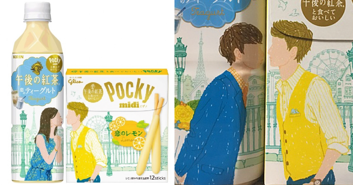
Most packages spend their short retail lives doing one job: standing upright, shouting a flavor name, and hoping someone notices before the expiration date arrives. In 2016, however, two Japanese brands gave their packages a social life. Ezaki Glico and Kirin Beverage released a coordinated Pocky-and-tea collaboration whose illustrated characters could kiss, exchange gifts, and complete romantic scenes when shoppers placed the products side by side.
The products were Pocky Midi <Koi no Lemon>, a lemon-chocolate biscuit snack, and Kirin Gogo no Kocha <Koi no Teagurt>, a yogurt-inspired tea drink. The flavors were developed to work together, reportedly creating a taste reminiscent of rare cheesecake. Yet the flavor pairing was only half the trick. The packages formed mix-and-match couples, turning a convenience-store shelf into something between a comic strip, a dating app, and an extremely polite romantic comedy.
Online users quickly realized that the designs did not have to be paired in the heterosexual combinations suggested by the campaign. Two male characters or two female characters could be placed together, producing same-sex kisses and affectionate scenes. Images spread on social media, and LGBTQ-focused publications reported enthusiastic reactions from members of Japan’s queer community.
The phrase “LGBT Japan approves” is playful headline language, not an official endorsement by an organization or government agency. Still, the positive response revealed something important: flexible design can create room for people whom advertising often leaves outside the frame.
How the Pocky and Kirin Packaging Collaboration Worked
The campaign was the second major pairing between two long-running Japanese brands. Glico’s Pocky is a coated biscuit-stick snack built around sharing, while Kirin’s Gogo no Kocha, commonly translated as “Afternoon Tea,” is a major ready-to-drink tea line. Their 2016 products launched nationally in Japan on February 16, shortly after Valentine’s Day, when store shelves were already operating at dangerously high levels of cuteness.
Two Flavors Designed to Become One Dessert
Glico coated the shorter, thicker Pocky Midi sticks with sweet-tart Sicilian lemon-flavored chocolate. Kirin created a “teagurt” beverage combining tea with a tangy, creamy yogurt-style profile. Consumed together, the companies said, the pairing suggested rare cheesecake, the Japanese term commonly used for an unbaked cheesecake.
That cross-product flavor concept mattered commercially. A shopper interested in the full experience needed both items, so each package effectively advertised the other. Instead of two brands competing for attention, they behaved like a snack duet. One supplied the crunch, the other supplied the sip, and neither had to carry the entire cheesecake fantasy alone.
Twelve Visual Combinations Encouraged Experimentation
The tea appeared in six package designs, while Pocky Midi appeared in two, creating 12 possible pairings. When aligned, the illustrations completed scenes across the package boundary. Characters leaned toward one another, kissed, offered flowers, presented cake, or participated in other small romantic moments.
The campaign also included an augmented-reality feature. Shoppers could place the products together, view them through a smartphone app, and watch an animation based on the illustrated couple. This was an ambitious idea for 2016, when pointing a phone at a snack package still felt like a futuristic activity rather than something people routinely did while waiting for the microwave.
Why the Same-Sex Pairings Became the Real Story
The official campaign centered on romance and complementary products, not a formal LGBTQ advocacy message. Company commentary at the time indicated that same-sex combinations were not presented as the campaign’s primary intention. However, the brands knew that users had experimented with queer pairings during the previous year’s collaboration, so social-media reactions were not entirely surprising.
That distinction is useful. The campaign was not a conventional Pride advertisement featuring rainbow colors, a statement about equality, or a clearly identified gay or lesbian couple. Its inclusiveness emerged from the structure of the design. Because the characters were distributed across separate packages, shoppers could rearrange the story. The audience became a co-author.
In a rigid advertisement, the brand decides who loves whom. In this packaging system, consumers could make that decision themselves. That small transfer of control transformed a product display into participatory media. A shopper did not merely observe representation; the shopper assembled it.
Accidental Inclusion Can Still Feel Meaningful
For LGBTQ consumers, visibility does not always need fireworks, a celebrity spokesperson, and a corporate manifesto that has survived 14 meetings with the legal department. Sometimes the meaningful moment is quieter: two ordinary illustrated men can kiss, two women can exchange a gift, and nobody on the package treats the scene as unusual.
This sense of ordinariness is part of the appeal. The same-sex combinations were playful rather than tragic, controversial, or educational. They simply fit into the campaign’s broader language of sweetness and affection.
In a media environment where queer relationships have often been framed as social issues before being framed as everyday relationships, a tiny shelf romance can carry more emotional weight than its cardboard dimensions suggest.
Packaging as a Tiny Piece of Interactive Media
Packaging usually has only seconds to make an impression. It must identify the brand, communicate the product, distinguish itself from nearby competitors, and avoid looking like a bottle of floor cleaner. The Glico-Kirin campaign added another task: the package had to invite physical interaction.
The visual scene was incomplete when either item stood alone. That incompleteness created curiosity. Shoppers had a reason to search for the matching product, move packages around, photograph the result, and share the image online. The shelf became a stage, and the gap between the tea bottle and snack box became the most important design element.
Research on consumer packaging consistently emphasizes visibility, recognition, emotional response, and ease of understanding. This campaign addressed all four. The illustrations were immediately charming, the characters helped unify two distinct brands, the romantic theme created emotion, and the completed scene explained the collaboration without requiring a paragraph of fine print.
The Design Rewarded Buying Both Products
Cross-brand promotions often rely on coupons, bundled pricing, or a logo announcing a partnership. Those methods can work, but they are not especially photogenic. Here, the benefit of buying both products was visible before purchase. The second item completed both the picture and the flavor experience.
This was clever because it connected the practical and emotional sides of the campaign. The products tasted better together, according to the brands, and looked happier together. Even the packages had relationship goals.
Social Sharing Was Built Into the Physical Object
The same-sex combinations spread because they were easy to understand in a single image. No long explanation was required. A photograph of two packages kissing delivered the joke, the design concept, and the inclusive interpretation almost instantly.
That is a useful lesson for modern marketing. A campaign does not become shareable merely because a social-media manager adds a hashtag. People share objects that give them something to discover, remix, or reveal. The Glico and Kirin packages offered all three.
Why the Campaign Resonated in Japan
The response should be viewed within Japan’s evolving conversation about LGBTQ visibility. In 2016, queer people were becoming more visible in entertainment, business discussions, and local advocacy, but national legal recognition remained limited.
That gap between cultural visibility and legal equality has continued. As of July 2026, Japan still does not recognize same-sex marriage nationally. The constitutional issue is now before the country’s Supreme Court following a series of conflicting, though mostly equality-supporting, lower-court decisions.
Local partnership systems have expanded widely, but they do not provide every legal right associated with marriage. Against that background, everyday commercial representation can matter.
A candy-and-tea campaign cannot change family law, inheritance rules, parental rights, or hospital visitation policies. It can, however, help normalize the simple fact that affection does not come in only one approved package configuration.
The campaign also arrived during a period when Japanese corporations were paying greater attention to LGBTQ consumers and employees. Marketing professionals and advocacy groups were encouraging companies to move beyond treating queer people as an invisible niche.
Glico and Kirin’s design did not solve that challenge, but it became a memorable example of how mainstream products could allow inclusive readings without turning the product aisle into a lecture hall.
What Brands Can Learn From the Kissing Packages
Design for Participation, Not Just Observation
The strongest feature was not the kiss itself. It was the invitation to rearrange the narrative. Brands can create similar engagement through connected labels, collectible designs, modular illustrations, paired products, or packaging that changes meaning when placed beside another item.
Participation gives consumers a reason to linger, and lingering is valuable in a crowded store. It also produces organic content because shoppers enjoy showing what they discovered. The campaign did not ask people to admire the designers from a respectful distance. It handed them the pieces and let them play.
Make Inclusion Part of Ordinary Life
Inclusive marketing is most convincing when diverse people are allowed to exist naturally within a brand world. LGBTQ characters do not always need to appear only during Pride Month, discuss discrimination, or serve as symbols of corporate bravery. They can flirt, share dessert, give flowers, and make a tea bottle look unusually confident.
At the same time, brands should not confuse a flexible illustration with a complete inclusion strategy. Consumers increasingly look at employment policies, community support, political giving, and long-term corporate behavior. A cute package can open the door, but corporate credibility has to walk through it.
Leave Enough Freedom for Audiences to Find Themselves
The campaign demonstrates the value of productive ambiguity. The illustrations had a clear romantic theme, yet the modular system allowed consumers to build different relationships. That openness encouraged people to project their own stories onto the packages.
However, ambiguity should not become an excuse for permanent silence. Brands sometimes enjoy praise for queer-coded content while refusing to acknowledge LGBTQ people directly. A more durable approach combines imaginative openness with clear internal values and consistent external support.
Related Experiences: What It Feels Like to Encounter a Shelf That Plays Back
Imagine entering a Japanese convenience store without knowing anything about the campaign. You are looking for a drink, perhaps something cold enough to make February feel less committed to being February. Then you notice that a character on a tea bottle is leaning suspiciously toward the edge of the label.
Beside it, a character on a Pocky box is leaning the other way. You slide the products closer. Suddenly, they kiss.
That small discovery changes the shopping experience. The packages are no longer containers; they are puzzle pieces. You begin testing combinations. One pair exchanges flowers. Another shares cake. Then you place two male characters together, or two female characters, and the scene still works. The shelf quietly tells you that the design system is more flexible than the default pairing.
For an LGBTQ shopper, that moment may feel delightfully disproportionate to the products involved. It is, after all, a snack and a bottle of tea. Nobody has delivered a speech. No dramatic music has started near the refrigerated case.
Yet the shopper can see a relationship resembling their own represented in a mainstream setting, without warning labels, euphemisms, or a special “diversity” section.
For a straight shopper, the experience can be equally useful. The same-sex pairing appears through play rather than confrontation. Curiosity leads to recognition. The shopper sees that the visual joke remains charming regardless of the characters’ genders.
That is how normalization often works: not through one grand argument, but through repeated ordinary encounters that make inclusion feel less novel and more human.
From a designer’s perspective, the experience is a reminder that the retail environment is physical. Online advertisements control framing, sequence, and placement. Store shelves do not. Products are moved by employees, customers, and the mysterious nighttime creatures responsible for putting one bottle in the wrong refrigerator.
A connected-package campaign must survive those variables. The concept becomes stronger when imperfect placement still invites experimentation.
From a retailer’s perspective, the display creates both opportunity and mild logistical comedy. The products need to be close enough for the relationship to make sense. Staff members may have to maintain the arrangement, while shoppers will inevitably remix it. In this case, remixing was not damage to the campaign; it was the campaign’s cultural engine.
For marketers, the most memorable experience is realizing how little text the idea required. “Put these together” was essentially the entire instruction. The design generated product trial, cross-purchase potential, social photographs, fan interpretations, LGBTQ discussion, and international media coverage.
That is an impressive workload for a few illustrated faces leaning across a package seam.
The campaign also teaches a more personal lesson about representation. People notice when they are included, especially in places where they did not expect to be seen. A supermarket shelf may seem trivial compared with laws, schools, workplaces, and families. It is trivial in comparison.
Yet culture is built from countless small signals about whose happiness is considered normal. The Pocky and tea packages sent a sweet signalliterally and figurativelythat more than one kind of couple could complete the picture.
Conclusion
Glico and Kirin turned a product collaboration into a miniature storytelling system. The lemon Pocky and yogurt-style tea complemented each other in flavor, while their matching packages created romantic scenes across the shelf. Consumers then expanded the idea by arranging same-sex couples, earning praise for an inclusive possibility that was playful, visible, and easy to share.
The campaign remains memorable because it did more than decorate two products. It encouraged shoppers to touch, combine, reinterpret, and photograph them. It demonstrated that packaging can be media, that a shelf can become interactive, and that representation sometimes enters culture through a surprisingly small openingroughly the width of the gap between a Pocky box and a tea bottle.
Note: This article discusses a limited-edition campaign launched in Japan in 2016. Product availability, mobile features, and Japan’s LGBTQ legal landscape have changed since the original release. The headline’s wording refers to reported positive reactions from parts of Japan’s LGBTQ community, not formal approval by the Japanese government or the entire community.

