
Beauty Tools & Accessories
30 Bright, Bold Colors That Go with Orange
Jul
Orange is not a shy color. It walks into a room wearing sunglasses, carrying a tray of margaritas, and somehow convincing the beige sofa to loosen up. Whether you love pumpkin, tangerine, coral, burnt orange, terracotta, persimmon, or a full-on traffic-cone moment, orange brings warmth, energy, personality, and a little bit of design mischief.
But here is the decorating dilemma: what colors go with orange without making your home look like a fruit basket exploded? The answer is wonderfully broad. Orange can be cozy with cream, dramatic with navy, tropical with turquoise, elegant with charcoal, earthy with olive, and unexpectedly chic with plum or blush. Because orange sits between red and yellow, it naturally feels warm, bold, and lively. Pair it with cooler shades for contrast, neutrals for balance, or equally saturated tones for a confident, designer-level palette.
This guide explores 30 bright, bold colors that go with orange, with practical examples for walls, furniture, fashion, home decor, party styling, and accent pieces. Think of it as your color matchmaking serviceminus the awkward first date.
Why Orange Works So Well in Color Palettes
Orange is one of the most expressive colors in interior design. It can feel vintage, modern, rustic, playful, spicy, earthy, or luxurious depending on the shade and what you pair it with. A soft peach reads gentle and romantic. A burnt orange feels grounded and autumnal. A vivid tangerine adds instant energy. A terracotta shade gives a room that “I casually vacation in Tuscany” effect, even if your most recent trip was to the grocery store.
The secret to decorating with orange is balance. Since orange is visually warm and energetic, it often benefits from a supporting color that either cools it down, softens it, or gives it structure. Blue is orange’s classic complementary color on the color wheel, which explains why navy, cobalt, aqua, and teal look so striking beside it. Greens bring in a natural, garden-inspired feel. Neutrals like cream, white, gray, taupe, and brown let orange shine without overwhelming the space. Metallics such as brass and gold enhance orange’s warmth and make the palette feel polished.
30 Colors That Go with Orange
1. Teal
Teal and orange are the design world’s favorite extroverted couple. Teal cools down orange while still feeling rich and dramatic. Try burnt orange velvet pillows on a teal sofa, or use teal cabinetry with terracotta tile in a kitchen. The result feels bold, balanced, and just a little glamorous.
2. Navy Blue
Navy is one of the most reliable colors to pair with orange. It gives orange a sophisticated frame, making even bright tangerine feel intentional rather than chaotic. In a living room, navy walls with orange art or cushions can create a handsome, high-contrast look. In fashion, a navy blazer with a rust-orange scarf is practically a cheat code for looking put-together.
3. Cobalt Blue
If navy is the calm older sibling, cobalt is the fun one who orders dessert first. Cobalt and orange create a powerful complementary palette that feels modern, artistic, and energetic. Use this combo in small doses if you want drama without visual overloadthink orange dining chairs around a cobalt-painted table, or cobalt vases on an orange-accented shelf.
4. Sky Blue
Sky blue softens orange beautifully. It is lighter and airier than navy or cobalt, making it ideal for bedrooms, breakfast nooks, beach houses, and cheerful family spaces. Pair sky-blue walls with orange artwork, coral bedding, or terracotta planters for a palette that feels fresh instead of loud.
5. Aqua
Aqua and orange create a tropical, sunny combination that works especially well in outdoor spaces, kids’ rooms, summer table settings, and coastal-inspired interiors. Aqua gives orange a splashy, poolside feeling. Add white trim or natural rattan to keep the palette breezy rather than overly sweet.
6. Turquoise
Turquoise has more punch than aqua and pairs beautifully with vivid orange. This color combination is perfect for bohemian rooms, Southwestern decor, and statement accessories. A turquoise rug with orange leather chairs can make a room feel collected, confident, and full of personality.
7. Emerald Green
Emerald green adds jewel-tone luxury to orange. When paired with burnt orange or persimmon, emerald creates a rich, dramatic palette that feels elegant but not boring. Use emerald curtains behind an orange accent chair, or place orange flowers in an emerald vase for a smaller commitment.
8. Olive Green
Olive green and orange create an earthy, grounded palette. This pairing works especially well with terracotta, rust, clay, and burnt orange. Olive walls with caramel leather, orange textiles, and wood furniture can make a room feel warm, mature, and deeply comfortable.
9. Sage Green
Sage green is a softer partner for orange. It takes the heat down a notch while keeping the palette organic and inviting. Try sage cabinets with coppery-orange hardware, a sage duvet with peach pillows, or sage walls with terracotta pottery. It is calm, stylish, and hard to mess up.
10. Mint Green
Mint green gives orange a playful retro twist. This combo can feel fresh in kitchens, bathrooms, nurseries, or creative studios. Pair mint with peach-orange for a sweet pastel scheme, or use mint with tangerine for a louder, midcentury-inspired look.
11. Forest Green
Forest green makes orange feel richer and more natural. It is a strong choice for fall-inspired interiors, moody living rooms, and cozy reading corners. A forest-green sofa with burnt orange pillows feels warm and grounded, like a cabin retreat with better lighting and fewer mosquitoes.
12. Cream
Cream is one of the easiest colors to pair with orange. It softens orange’s intensity without making the palette feel cold. Use cream walls with orange furniture, cream bedding with rust accents, or cream curtains in a room with terracotta paint. Cream lets orange be the star while quietly doing all the emotional support work.
13. Warm White
Warm white keeps orange clean, bright, and modern. Unlike stark white, warm white has a touch of softness that works well with orange undertones. It is perfect for orange front doors, orange kitchen stools, or colorful artwork against white walls.
14. Charcoal Gray
Charcoal gray gives orange a sleek, urban edge. This pairing works especially well in modern apartments, home offices, and masculine-leaning interiors. Charcoal walls with orange lamps or artwork create sharp contrast without feeling too flashy.
15. Soft Gray
Soft gray is a quieter choice that allows orange to pop gently. It works with peach, coral, rust, and pumpkin shades. A soft gray sofa with orange pillows is a simple way to add warmth to a neutral living room without repainting everything or scaring the dog.
16. Black
Black and orange can be tricky because the combination instantly reminds people of Halloween. The trick is to use one color as a sophisticated accent. Matte black fixtures with terracotta tile look chic. A black dining table with burnt orange chairs feels dramatic. Add cream, wood, or brass to avoid costume-party energy.
17. Chocolate Brown
Chocolate brown and orange are warm, cozy, and deeply inviting. This palette works beautifully with leather, wood, wool, and woven textures. Use chocolate brown furniture with orange textiles for a grounded look that feels classic and comfortable.
18. Camel
Camel is a warm neutral that blends naturally with orange. It is especially good with rust, terracotta, and burnt orange. A camel sofa with orange pillows or a camel coat with an orange scarf creates a polished, tonal look that feels expensive even when it is not.
19. Taupe
Taupe is a sophisticated neutral that keeps orange from becoming too loud. Since many taupes have warm undertones, they pair well with clay, peach, and coppery-orange shades. Use taupe walls as a calm backdrop for orange decor, or mix taupe upholstery with terracotta accents.
20. Beige
Beige and orange are natural friends, especially when you want warmth without high drama. Beige rugs, linen curtains, and woven baskets help orange feel relaxed and approachable. This is a great palette for casual living rooms, sunrooms, and bedrooms.
21. Mustard Yellow
Mustard yellow and orange create a warm, retro palette with serious personality. Use this combination when you want a room to feel cheerful and vintage-inspired. Add walnut wood, olive green, or cream to keep the look grounded. Without balance, mustard and orange can become a little too “1970s basement,” and nobody wants emotional paneling.
22. Gold
Gold enhances orange’s natural warmth. Brass lighting, gold frames, and warm metallic hardware all work beautifully with orange walls, furniture, and decor. This pairing is especially effective with deep orange, persimmon, rust, and terracotta.
23. Copper
Copper and orange create a tonal, glowing palette. Because copper already contains orange undertones, it blends seamlessly with warm orange shades. Try copper pendant lights above a terracotta backsplash, or copper accessories in a room with burnt orange upholstery.
24. Blush Pink
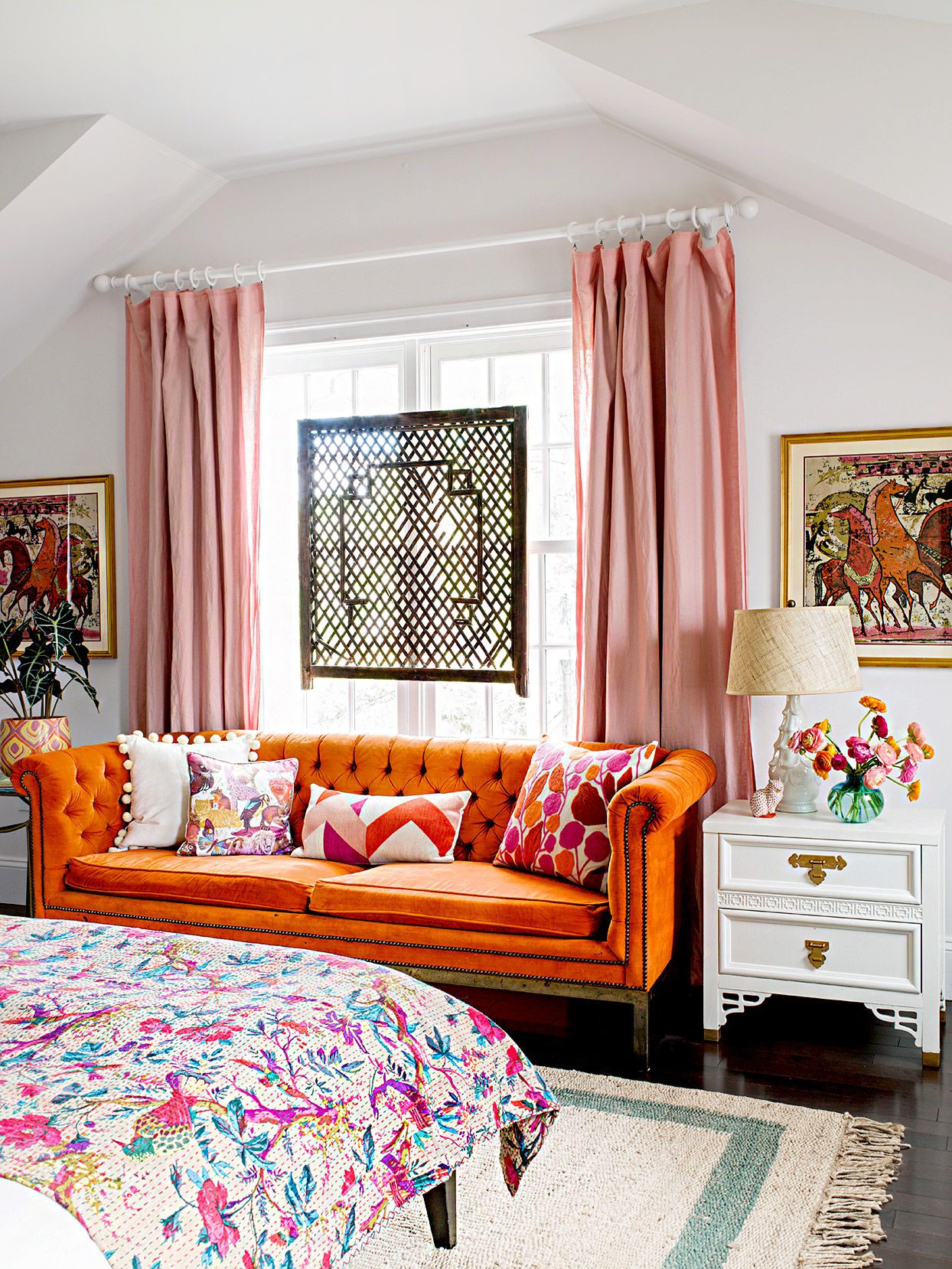
Blush pink softens orange and adds a romantic, modern feel. It works beautifully with coral, peach, and persimmon. Use blush walls with orange artwork, or combine blush textiles with terracotta ceramics. This palette feels warm, flattering, and surprisingly grown-up.
25. Hot Pink
Hot pink and orange are not here to whisper. This combination is bold, joyful, and fashion-forward. Use it for party decor, statement art, modern bedrooms, or maximalist interiors. To keep it polished, add plenty of white space or grounding neutrals.
26. Coral
Coral is orange’s softer cousin, blending orange and pink into one cheerful shade. Pair coral with deeper orange for a layered, monochromatic effect. This works well in summer decor, bedding, floral arrangements, and coastal rooms.
27. Plum
Plum gives orange a moody, elegant contrast. Deep purple tones pair especially well with burnt orange, rust, and copper. A plum velvet chair with orange piping, or orange artwork against plum walls, can make a room feel dramatic and refined.
28. Lavender
Lavender offers a softer, more unexpected contrast to orange. It works best with peach, coral, or muted terracotta rather than neon orange. Lavender walls with peach bedding can feel fresh, creative, and gently whimsical.
29. Red
Red and orange create a fiery analogous palette because they sit next to each other on the color wheel. This combination is high-energy and works best when one shade is dominant and the other is an accent. Try rust-orange with burgundy, tomato red with peach, or coral with deep red for a layered warm look.
30. White
White gives orange the breathing room it needs. A crisp white background makes orange feel clean, graphic, and intentional. Orange chairs in a white kitchen, orange bedding in a white room, or orange artwork on white walls can look fresh and confident without overwhelming the eye.
How to Choose the Best Orange Color Combination
Start with the Shade of Orange
Not all oranges behave the same way. Bright tangerine loves bold partners like cobalt, hot pink, and turquoise. Burnt orange prefers olive, cream, navy, and chocolate brown. Peach works well with sage, blush, lavender, and warm white. Terracotta pairs beautifully with beige, taupe, forest green, and copper.
Decide the Mood First
Before choosing a color partner, decide how you want the room or outfit to feel. For a calm look, pair orange with cream, sage, soft gray, or warm white. For drama, choose navy, emerald, plum, charcoal, or black. For a fun, energetic palette, go with aqua, turquoise, cobalt, mustard, or hot pink.
Use the 60-30-10 Rule
A simple way to balance orange is the 60-30-10 rule: use one dominant color for 60 percent of the design, a secondary color for 30 percent, and orange or another accent color for 10 percent. For example, a room could be 60 percent cream, 30 percent olive green, and 10 percent burnt orange. This keeps orange exciting instead of exhausting.
Bring in Texture
Orange becomes easier to decorate with when texture is involved. Think velvet pillows, terracotta pots, woven baskets, linen curtains, leather chairs, ceramic lamps, wool rugs, and brass hardware. Texture gives orange depth, so it feels stylish rather than flat.
Best Orange Pairings by Design Style
Modern Style
For modern interiors, pair orange with white, black, charcoal, cobalt, or navy. Keep lines clean and use orange as a strong accent. A white room with a single orange sofa can look more intentional than a room full of competing bright colors.
Bohemian Style
Bohemian rooms love orange. Pair terracotta and rust with turquoise, olive, mustard, cream, and wood tones. Add patterned textiles, plants, rattan, and handmade ceramics for a relaxed, collected look.
Midcentury Modern Style
Burnt orange, teal, walnut wood, mustard yellow, and cream are classic midcentury-inspired partners. Use orange chairs, teak furniture, geometric art, and simple silhouettes for a look that feels vintage but not dusty.
Coastal Style
For a coastal take on orange, choose coral, peach, or soft tangerine and pair it with sky blue, aqua, white, sand, and light wood. This palette feels sunny and casual without turning your home into a seafood restaurant.
Rustic Style
Rustic interiors work well with burnt orange, chocolate brown, forest green, cream, camel, and copper. Use natural materials like wood, stone, leather, and linen to make orange feel organic and grounded.
Common Mistakes When Decorating with Orange
Using Too Much Bright Orange at Once
Orange is powerful. A little can energize a room; too much can make it feel like the walls are yelling motivational quotes at you. If you are new to orange, start with pillows, artwork, lamps, throws, or painted furniture before committing to all four walls.
Ignoring Undertones
Orange can lean red, yellow, brown, pink, or peach. A red-orange may clash with a yellow-green, while a peach-orange may look perfect with sage. Always compare swatches in natural and artificial light before making a final decision.
Forgetting Neutrals
Bold colors need visual rest. Cream, white, beige, taupe, gray, and wood tones can help orange feel balanced. Even maximalist rooms benefit from a few calm surfaces where the eye can take a tiny design nap.
Real-Life Experience: What Decorating with Orange Actually Feels Like
Decorating with orange is a bit like inviting a very charismatic friend to dinner. You are excited they are coming, but you also know they might dominate the conversation if nobody gently redirects them. In real homes, orange rarely behaves like a background color. It wants attention. That is not a flaw; it is the whole point. The challenge is learning how to give orange a role without letting it take over the entire production.
One practical experience many decorators discover quickly is that orange changes dramatically depending on lighting. A terracotta pillow that looks soft and earthy in morning light may appear much redder under warm evening bulbs. A bright tangerine accessory that feels fresh in a sunroom might look intense in a small hallway. That is why testing matters. Before painting a wall orange, it is smart to tape up large samples and observe them throughout the day. Orange has range. Sometimes it gives “Tuscan villa.” Sometimes it gives “sports drink.” The difference can be lighting, undertone, and surrounding colors.
Another helpful lesson is that orange works best when repeated intentionally. A single orange object can look accidental, like it wandered into the room unsupervised. But if you repeat orange two or three timesa pillow, a vase, a piece of artthe color suddenly feels planned. This does not mean everything must match perfectly. In fact, orange often looks better when shades vary slightly. A burnt orange throw, a coral print, and a terracotta pot can create a layered palette that feels natural and relaxed.
Texture also makes a huge difference. Bright orange plastic can feel playful, but orange velvet feels luxurious. Terracotta ceramic feels earthy. Orange linen feels casual. Burnt orange leather feels timeless. If a color feels too loud, try changing the material before abandoning the shade completely. A vivid orange wall might feel too much, but the same color on a small lacquered tray or framed artwork may be exactly enough.
In experience, the most livable orange palettes usually include at least one grounding element. Navy gives structure. Olive makes orange feel organic. Cream softens it. Wood warms it. Charcoal sharpens it. Even hot pink and orange, one of the loudest pairings, becomes more stylish when balanced with white, black, or natural fiber. Orange does not need to be tamed into boredom; it just needs a good supporting cast.
For beginners, the easiest way to use orange is through seasonal accents that do not scream “temporary decoration.” Instead of pumpkins everywhere, try rust-colored pillow covers, a persimmon vase, copper candleholders, or a terracotta planter. These pieces work in fall but can also stay out year-round. In kitchens, orange looks fantastic through fruit bowls, painted stools, patterned dish towels, or warm tile. In living rooms, an orange accent chair can become the memorable piece that makes the whole space feel designed.
The biggest surprise is how versatile orange becomes once you stop treating it as risky. It can be elegant with plum, classic with navy, fresh with sky blue, earthy with sage, and glamorous with gold. Orange is not just a color for autumn, sports teams, or emergency cones. Used thoughtfully, it brings warmth, confidence, creativity, and joy into a space. And honestly, most rooms could use at least a little more joy.
Conclusion
Orange is bold, warm, expressive, and surprisingly flexible. Whether you are decorating a living room, choosing an outfit, refreshing a kitchen, planning a party, or simply wondering what color pillow will rescue your beige sofa from a life of quiet sadness, orange gives you plenty to work with. The best colors that go with orange include classic complements like navy, teal, cobalt, and sky blue; earthy partners like olive, sage, forest green, camel, and chocolate brown; soft neutrals like cream, beige, taupe, and warm white; and adventurous choices like hot pink, plum, lavender, mustard, and emerald.
The key is to match the orange shade to the mood you want. Use bright orange for energy, burnt orange for warmth, peach for softness, coral for cheer, and terracotta for grounded elegance. Balance it with texture, neutrals, natural materials, and repeated accents. Done right, orange does not just decorate a spaceit wakes it up, gives it personality, and makes it feel alive.

